Business card

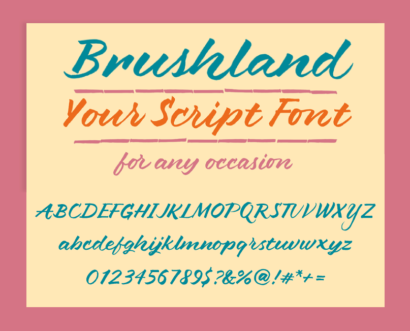
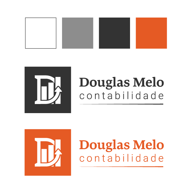
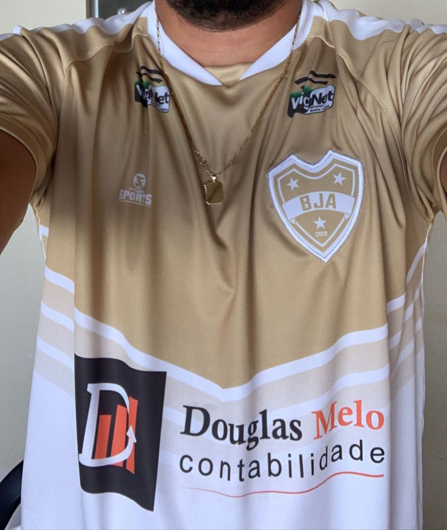
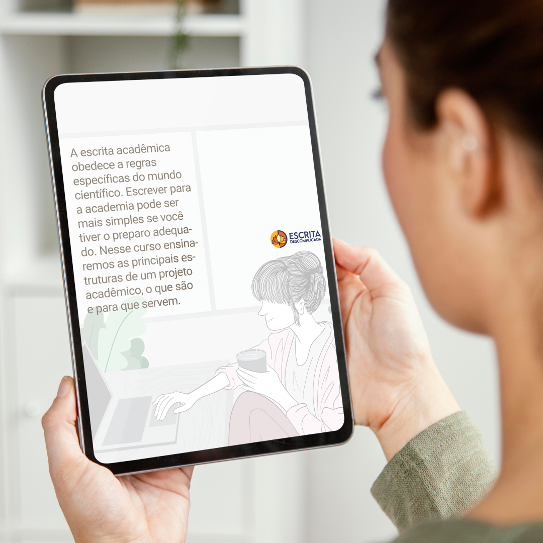
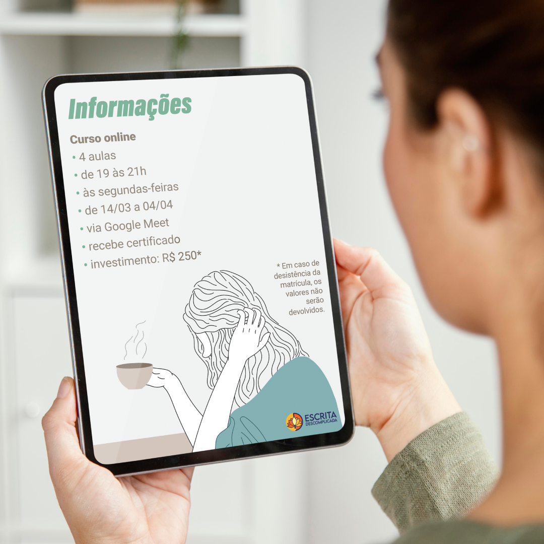
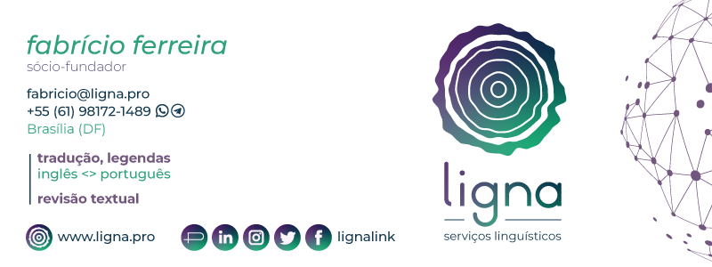
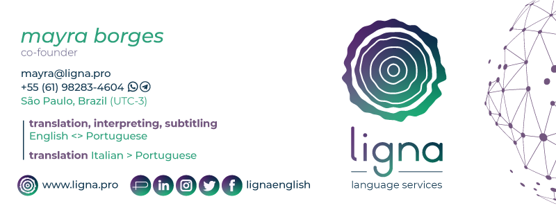
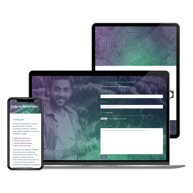
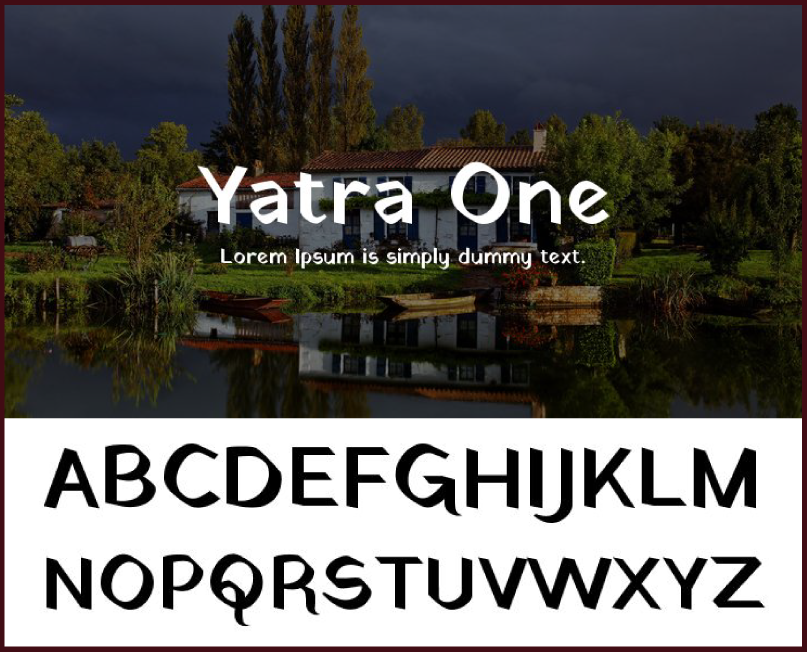
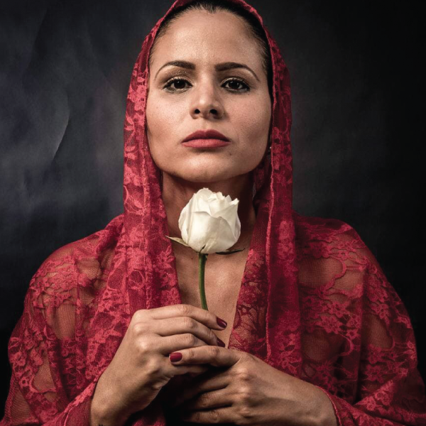
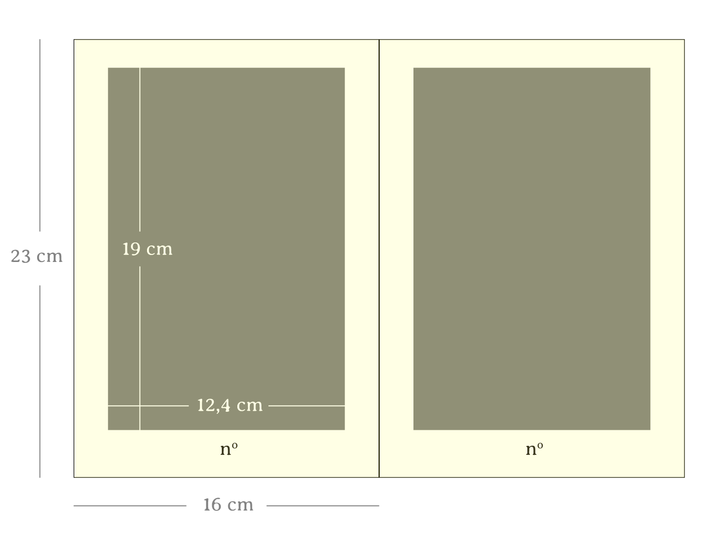
After creating a logo for a new visual identity, one of the first points of contact is often the business card. This can lead to challenges such as defining the use of colors, typefaces, icons, images, and other supporting elements; as well as planning the contact details and addresses to use.

Hello world!

In programming, "hello world" is commonly used as a test that confirms: the system is up and running! It's a message that brings a sense of initial success, a starting point for the accomplishments to come. Thus, "hello world" marks the rebirth of my brand and website, a new chapter in my professional career.

Catavento

Briefing

Develop the logo for the brand Catavento (which means "Whirligig" in Portuguese), a circus company based in Goiânia (GO) that operates in the artistic and circus training areas.

After a rich and complete creative process, from the briefing to the completion of the final proposal, we arrived at a result that has been praised in recent years, according to the testimonial of the client to the end of this page.

Here you can see details about the construction of the logo as well as the various applications in which it has been used since then.

Concept

From the briefing with the client Felipe Nicknig, we have: "A Catavento is a circus company specializing in aerial acrobatics. It is driven by the concern and investigation of what the contemporary circus is and its creation process. From this process come shows, performances, etc".

Felipe still reiterates: "An innovative company that makes experimentation and improvisation its vault of creation with smoothness and fluidity.< /em>"

The creation of the symbol

Circus tent
 
Whirligig
 
Golden Ratio

Circus tent

Image search converging on a pattern.

Whirligig

Diversity and also convergence in research.

Golden Ratio or Fibonacci Sequence

The quest for the perfect shape!

Color

Symbol design

Typography

Logo composition

Writing the name with the typography "Fonarto"

Adjustment for the letter "C" to have a curve like the letter "e", giving more the idea of spin and acrobatics:

Addition of the description (tagline) with the typography "Linux Libertine":

Adequacy of the symbol to have unity with the letters (typography):

Final result:

Poster for the show "Ao Esperar"

Possibility of poster for the presentation.

Acrobatic apparatus
Sunset in Goiânia on 85th avenue
Viaduct Latif Sebba

Application simulations:

Below are examples of use of the logo after delivery, developed by other professionals.

Company front

T-shirts

Posters

Others

Article in newspaper

Website

Client's testimonial

We were lucky to meet Pedro Henrique in the context of our rebranding efforts. He is a professional who adeptly brought our ideas alive and conveyed them in unexpected ways! He was very friendly and met the deadlines we agreed. Our logo continues to draw praise to this day. The new visual identity reflects our essence and accurately translates our corporate values into the visual and interactive design!”

Felipe Nicknig
~ Circus artist, teacher and director ~
felipenicknig@gmail.com
www.ciacatavento.com.br

Diário Central

About


Here you can see some of the work I did for the newspaper Diário Central in 2017, in which I worked as a graphic designer being, in addition to designer seeking to develop creative pages, he was also responsible for graphic improvements such as choice of typographic fonts, creation of layouts such as identity strong> of the Classifieds page, as well as the closing of PDF files and sending them to the printer responsible for printing.

See a full edition of the newspaper

Turn the pages below:

Turn the pages below:

Download: 

Coworker's testimonial

Briefing

Develop the entire design part, both the cover and pages, of the book Dança do Sagrado Ventre - Uma Dança de Curar, by author Luana Medeiros; in addition to other graphic pieces such as a poster and a certificate.

Through a rich process that involved stages such as dialogue, research, observation and refinement of ideas, we arrived at a result that impresses; leaving the customer satisfied, as shown in the testimonials received from her at the bottom of this page.

Every detail of the book was carefully designed, such as the choice of format, paper type, fonts, spacing, information hierarchy, photo treatment, decorative elements, etc.

Concept

After the briefing and information gathering, analysis of similar and other procedural steps, we guided the choices of this project referring to the old, knowledge and wisdom , the sacred of the feminine, ancestral wealth, strength with delicacy and dance strong>.

Typography

Cover's assets

Cover design

Mockup

Page design

Launch poster

Book sample

Turn the pages below:

Turn the pages below:

Click to download: 

Client's Instagram

Client's testimonial

I value sensitivity, authenticity and creativity in all my work. Thanks to Pedro for accepting my more “extravagant” ideas and synthesizing them in unique and whimsical certificates. The beauty and delicacy in the work, the whim and welcoming of my ideas in a calm and receptive way, helped a lot for the result so beautiful and full of life that emerged at the end.”

Luana Medeiros
~ Systemic, integrative therapist and fortune teller~
luanamedeirosterapeuta@gmail.com
www.luanamedeiros.com.br

Thank you for your patience in preparing the book, as it was very challenging to structure it with the beauty I wanted over eight years of work. The whim, zeal and care with the work were incredible, as well as the creativity that was added to everything I envisioned as a structure. I tried to transport people who read it to what the Sacred Belly Dance is: a healing temple. I am grateful for the whole process and partnership.”

Luana Medeiros
~ Systemic, integrative therapist and fortune teller~
luanamedeirosterapeuta@gmail.com
www.luanamedeiros.com.br

Douglas Melo – Logo

Briefing

To create a logo and its basic applications for Douglas Melo, an accountant and finance consultant from the city of Morro Agudo de Goiás, because he understands the differential that a service provided by a professional graphics designer can bring. After the entire creation process, from briefing (requirements gathering) to delivery, going through research, sketches and finishing, the client was satisfied, according to his testimonial at the end of this page.

Concept

Personality, stability and growth . A competent accounting consultancy is essential for any activity.  Development and expansion, more than just being sustainable, always presenting better pictures than the previous ones. Douglas Melo is a competent professional and committed with the results of his work.

Research and inspiration

Typography

Development of the logo

Colors

The tiger is an animal that can represent characteristics such as strength, courage and vigor, exuberant in its orange, black and white colors. In the context of finance, it was used to represent emerging eastern countries undergoing a rapid process of economic development - the Four Asian Tigers: Hong Kong, Singapore, South Korea and Taiwan.

The twilight, which is the moment when the Sun is touching the horizon, either at sunrise or at sunset, among the various colors involved in the phenomenon, a color tahat stands out is orange, representing here also the strength of the star that illuminates the path, that warms and around which our planet moves regularly and orderly, just as financial management ideally should be.

Applications

Digital posters

Client's testimonial

I looked for Pedro on the recommendation of a friend: she showed me one of his works which motivated me hire him. He created my logo, gave me all the support. He is very creative and a good professional. My brand gained more prominence, this motivated me to publicize my business. I sponsored local soccer teams, printed caps, my company gained an identity. All of this is important for any business. I recommend him!”

Douglas Melo
~ Financial advisor and accountant ~
douglascrc18@gmail.com
instagram.com/douglascrc18

Escrita Descomplicada – Como escrever um projeto acadêmico (EN)

Briefing

Develop sequential posters for a course taught by Vânia Vidal, a writer, translator and proofreader. Vânia came to me because she understands the difference that graphic design brings in terms of results in the dissemination and sale of products and services. After a rich development process, we arrived at an impressive result that meets the objective, leaving the customer satisfied, according to the testimonial at the end of this page.

Concept

The softness of the simple. Although academic writing is full of specific rules of the scientific world, this course aims to simplify and make the whole process of how to produce an academic project more accessible.

Basic resources

Typography

Mockup

Flipbook

Turn the pages:

Download: 

Depoimento da cliente

I looked for Pedro Henrique to make posters to publicize my courses, as well as a curriculum and portfolio. Couldn’t have chosen better! Very empathetic in the relationship with the client, Pedro has a work of rare beauty, delicacy and vigor. In addition, he is very attentive to deadlines and brings the client results of accurate quality and beauty! I highly recommend!”

Vânia Vidal

Escrita Descomplicada – O Escrever como Potência (EN)

Briefing

Develop sequential posters for a course taught by Vânia Vidal, a writer, translator and proofreader. Vânia came to me because she understands the differential that graphic design brings in terms of results in the dissemination and sale of products and services. After a rich development process, we arrived at a result that impresses and fulfills the objective, leaving the client satisfied, according to the testimonial at the end of this page.

Concept

One of the ways to refer to potency is through flames. Like the strength of the sun. Like the power of combustion engines. Through the symbologies of light, heat and renewal that fire brings. Thus, an association was made with the creative writing process, which, when stimulated, can bring out a whole dormant power.

Basic resourses

Typography

Mockup

Flipbook

Turn the pages:

Download: 

"Online class" version ("Turma online")

Concept

For the online class, taking advantage in part of what has been developed so far, this time the concept of color explosion was conceived, referring to to the screens of electronic devices where courses in this new modality were taught.

Basic resources

Mockup

Client's testimonial

I looked for Pedro Henrique to make posters to publicize my courses, as well as a curriculum and portfolio. Couldn’t have chosen better! Very empathetic in the relationship with the client, Pedro has a work of rare beauty, delicacy and vigor. In addition, he is very attentive to deadlines and brings the client results of accurate quality and beauty! I highly recommend!”

Vânia Vidal

Priscilla Kern – Creative resume

Briefing

Develop a creative curriculum for Priscilla Kern, a researcher, art educator and project manager who works with the concept of the body. Priscilla is looking for differentials from its competitors, vacancies and connections in the market. After a rich process, from the initial conversation and briefing to the presentation of proposals, we got an impressive result that fulfill her needs, making her satisfied, according to the testimonial at the end of this page.

Research and inspirations

Typography

Basic features

Compositions

Mockup

Flipbook

Turn the pages:

Download: 

Client's testimonial

Pedro’s name came up in a conversation with a colleague about the importance of a good resume for prospecting jobs. The referral translated into trust, expertise, and quality. Pedro works carefully through the project with the client and captures every detail to deliver consistent ‘products’ with quality. Moreover, the value he delivers for the money makes customers want to come back.

Priscilla Kern
~ Researcher, art educator and project manager ~
priscilla.cultura@gmail.com
instagram.com/priscillalkern

Ligna

Briefing

To create the graphics design communication for the brand Ligna, an emerging company that offers translation and linguistic services in general, nationally and internationally, for a communicative, technological and casual public. After the conceptualization, its representation was created through the logoand visual identity, in addition to applications such as business cards printed and digital, email signatures, responsive trilingual website, social networks and an institutional catalogue.

Naming

In Latin, lignum means "firewood", in the singular. Ligna is the plural of lignum, that is, "firewood", in the plural.

Each line in a cross section of a tree trunk tells part of its story, because in the hot seasons of the year it grows more than in the cold seasons, forming these layers as in image above.

In addition to a very welcome sound and a simple and interesting spelling, this name was thought to refer to various aspects related to trees, such as roots, soil, trunks, branches, leaves, fruits, sky etc. These elements have a rich metaphorical sense to create associations, as we will see below.

Name: Ligna
Site Domain: www.ligna.pro
Main email: contact@ligna.pro

Tagline: Linguage Services
Slogan: Branch out
Social networks in Portuguese: @lignalink
Social networks in English: @lignaenglish

Concept

Seeking to expand the meaning through research inspired by trees, it was defined for the brand Ligna the concept "Connections and Branches. ".

Languages ​​branched off and gave rise to new languages. Professionals connect with clients, form partnerships, networking. Constellations were perceived through connections between their points. Lightning, river tributaries and branches fork. Roots and fungi form mycelial networks underground. Veins and arteries subdivide, running through the entire human body. Families connect, reproduce and leave their descendants, as in family trees. Molecules are composed from the connection of atoms, also forming chemical compounds that react with each other. Computer integrated circuits and the internet itself. The Theory of Evolution, and more!

Typography

Symbol

Typogram

Social Networks

Cover

Mail signatures

Responsive trilingual website

Click to acess:

Turn the pages below:

Turn the pages below:

Click to download: 

Client's testimonials

I got just the tailor-made work I wanted, but it was no miracle. I was guided by a thorough, straightforward, and effective creative process that made it easy to articulate my requirements and ideas and watch as his work ripened every step of the way. It was nothing like the soulless, detached designs out there. I trust Pedro personally and professionally and will certainly come back to him for future projects.”

Lucas Magdiel

Pedro designed a website and visual identity for our business, and I was impressed by the commitment, patience, and professionalism he showed over months of work. He welcomes all feedback and delivers creative solutions to accommodate his clients’ needs. I recommend his services to anyone looking for a competent designer, and will look no further for similar jobs in the future.”

Fabrício Ferreira

From project day one, Pedro has gone out of his way to deliver designs that profoundly convey the brief in every detail and goes brilliantly above and beyond. His working style, the ongoing exchanges, his synergy with the client, his diligence in fully delivering the commission to absolutely professional standards… Just the perfect balance of expertise, hard work, talent, insight, and inspiration.”

Mayra Borges
~ Translator, proofreader and interpreter ~
mayra@ligna.pro
www.ligna.pro
Scroll to top